
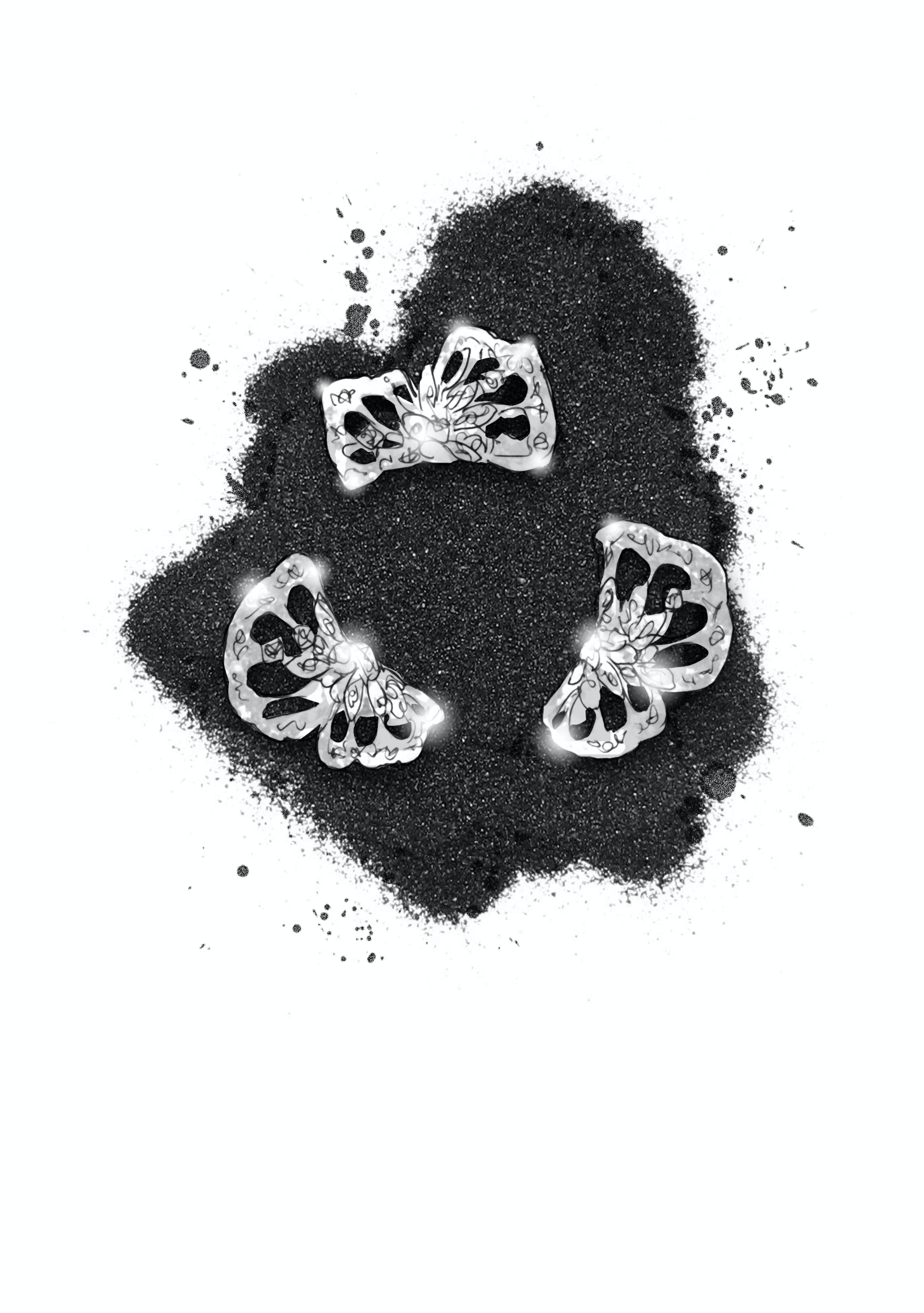
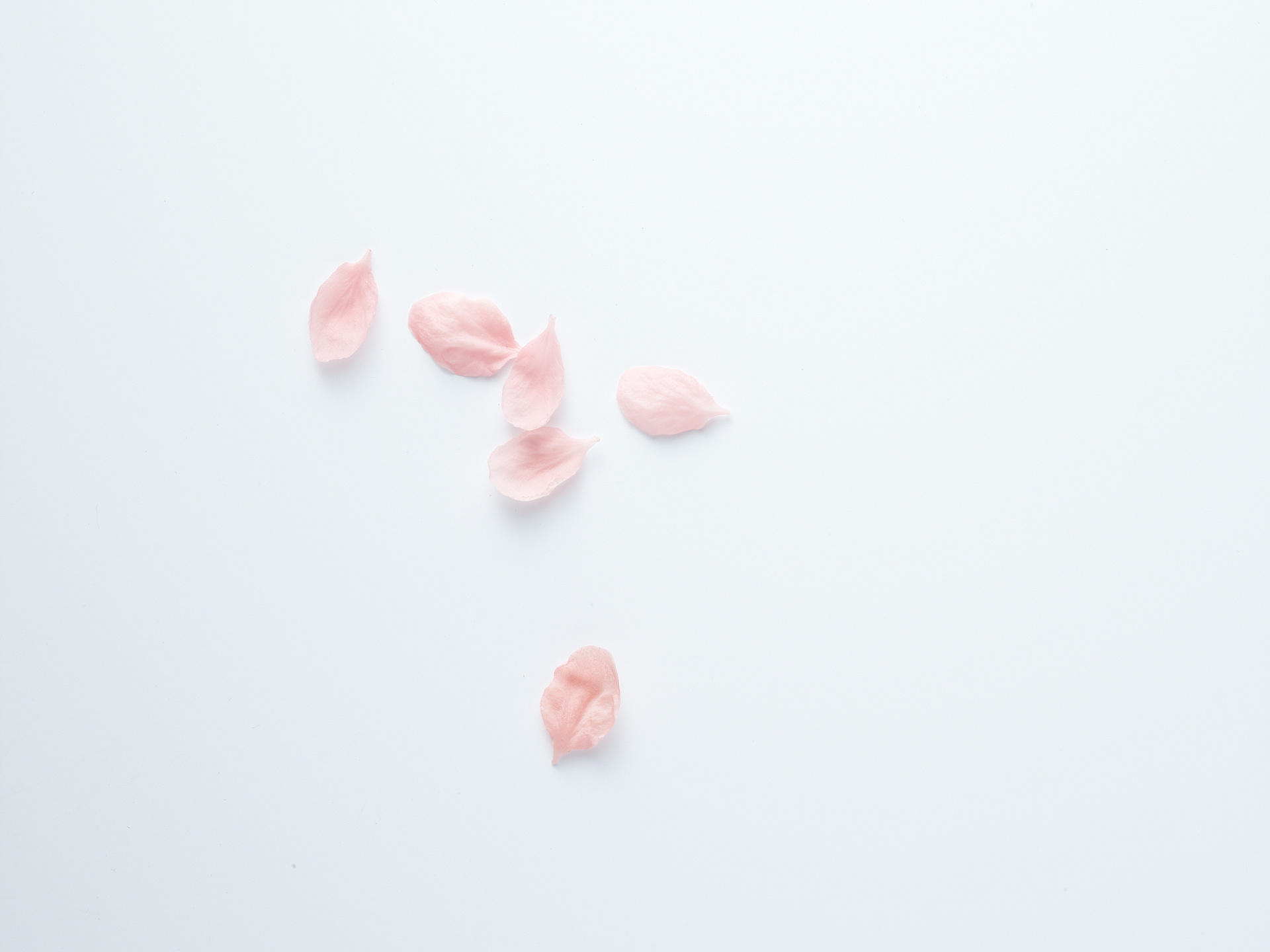
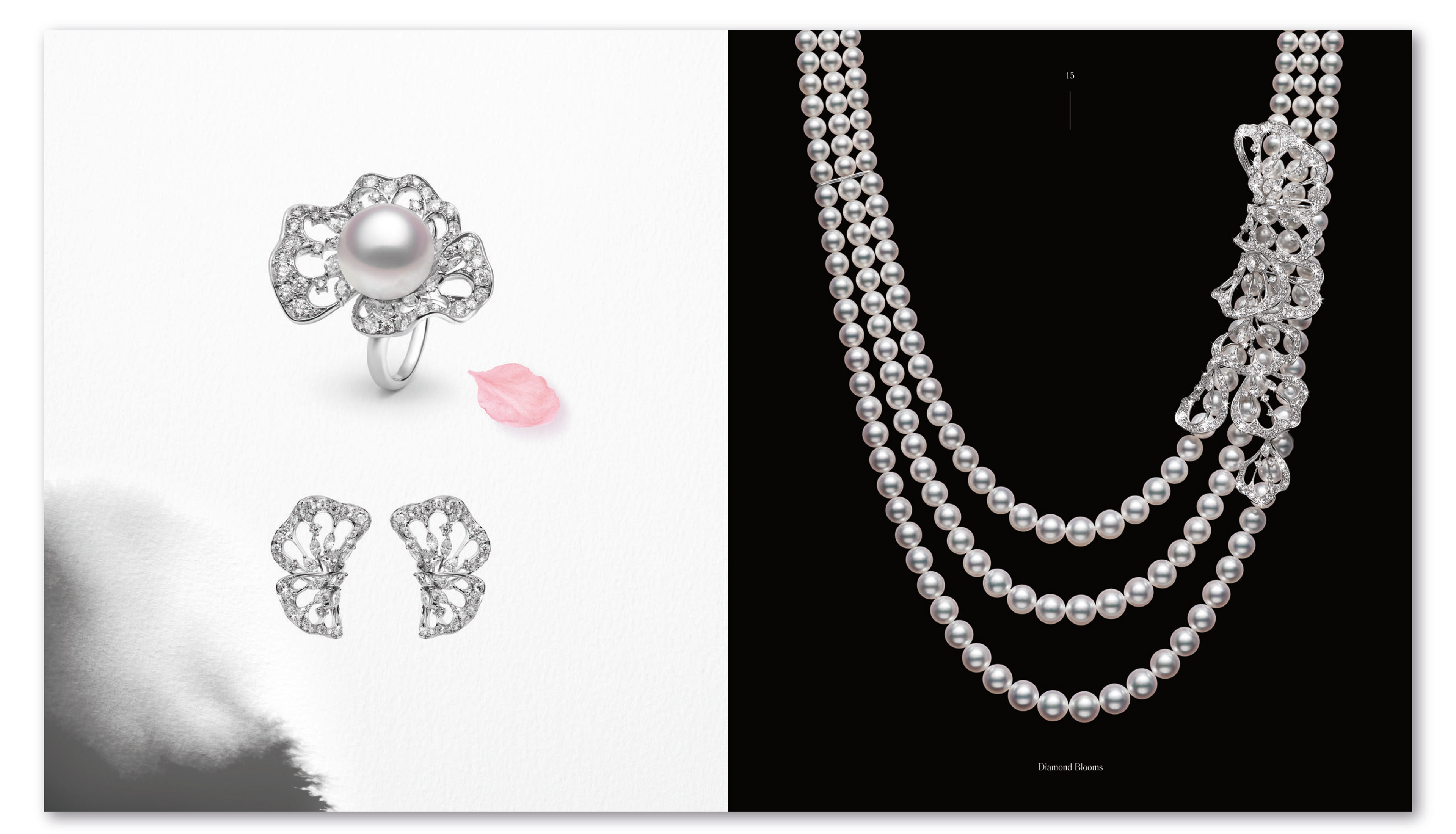
Below are the first concepts presented to the client. I designed 3 alternate dust-jacket designs as a collectors item idea, as well as getting a visualiser to sketch up some of the art direction ideas I had for the photoshoot. Using black sand and scattered cherry blossom petals around the jewellery for that Japanese feel...

Art direction style:
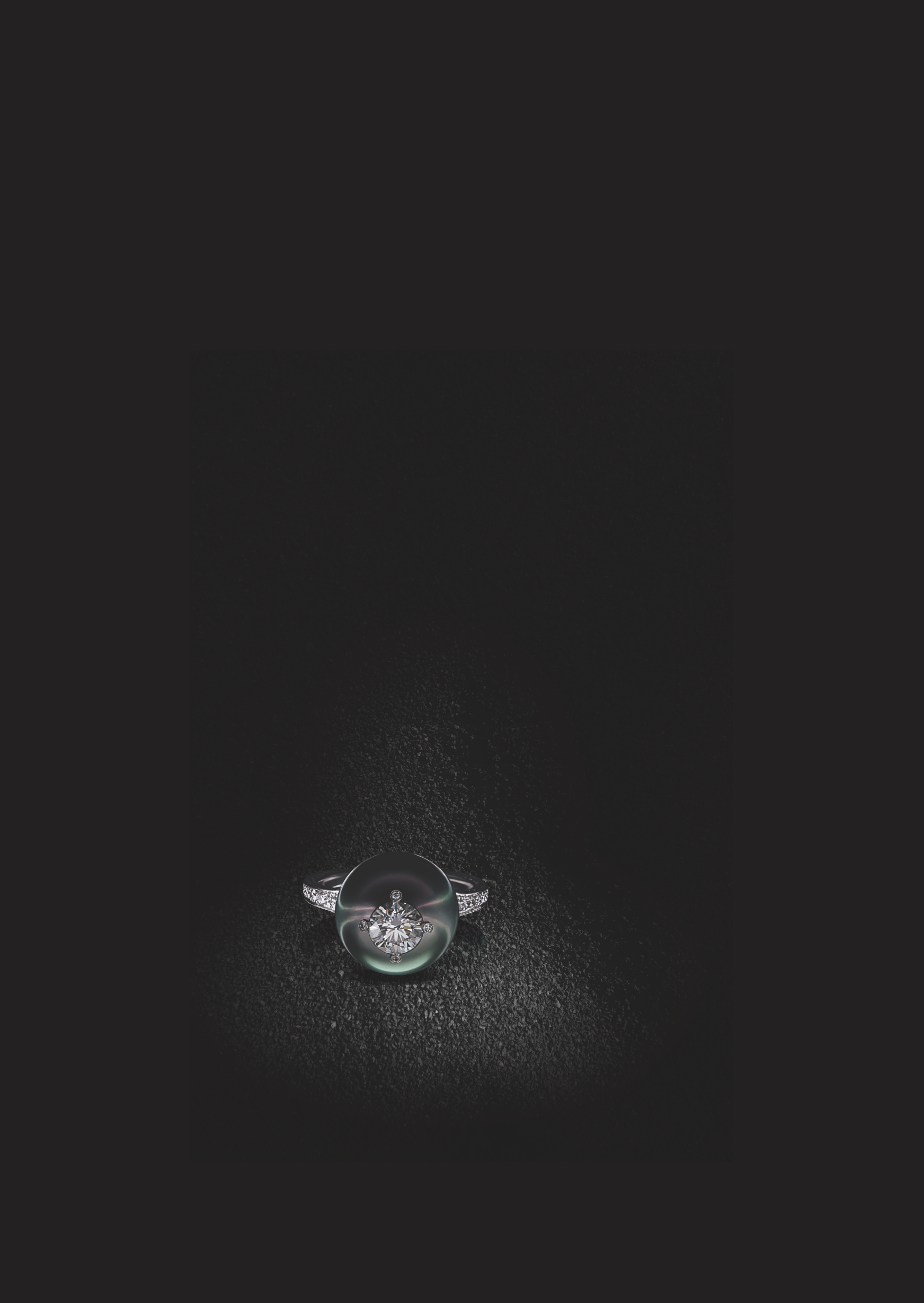
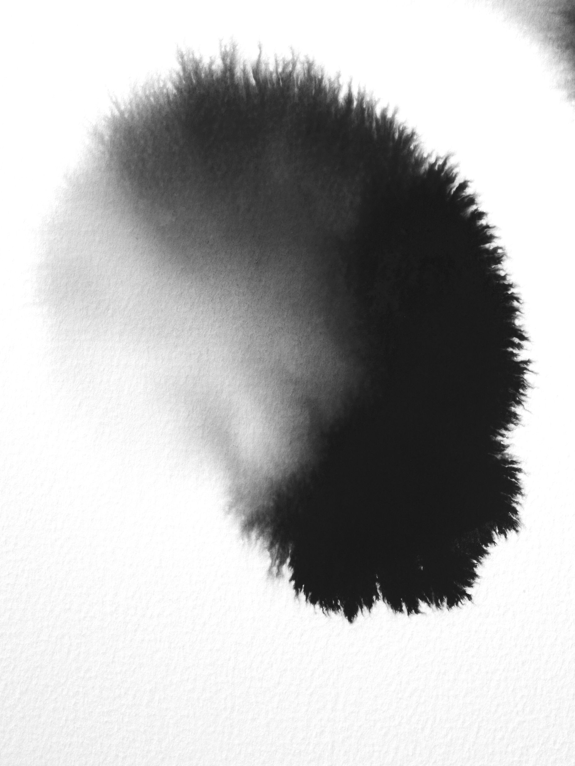
Exploring textures, props and ink patterns:


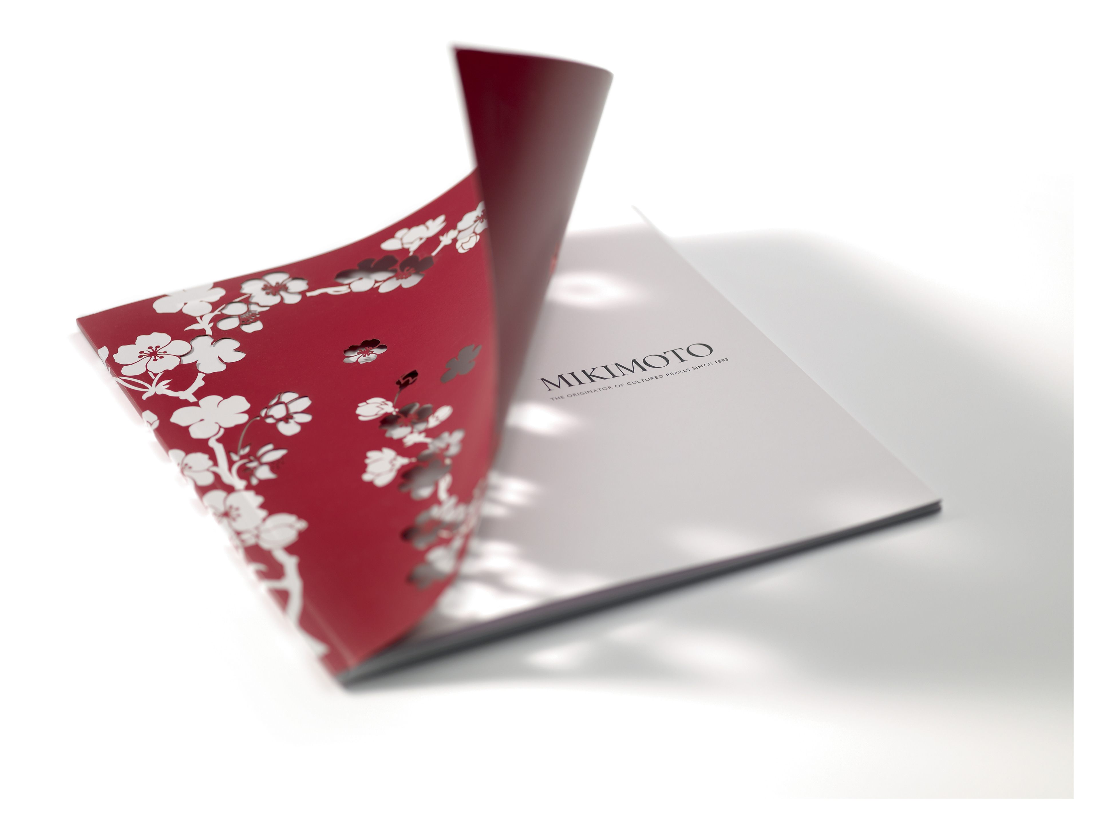
Final brochure shots... Beautiful light shines through the laser cut cover - giving it an elegant feel...
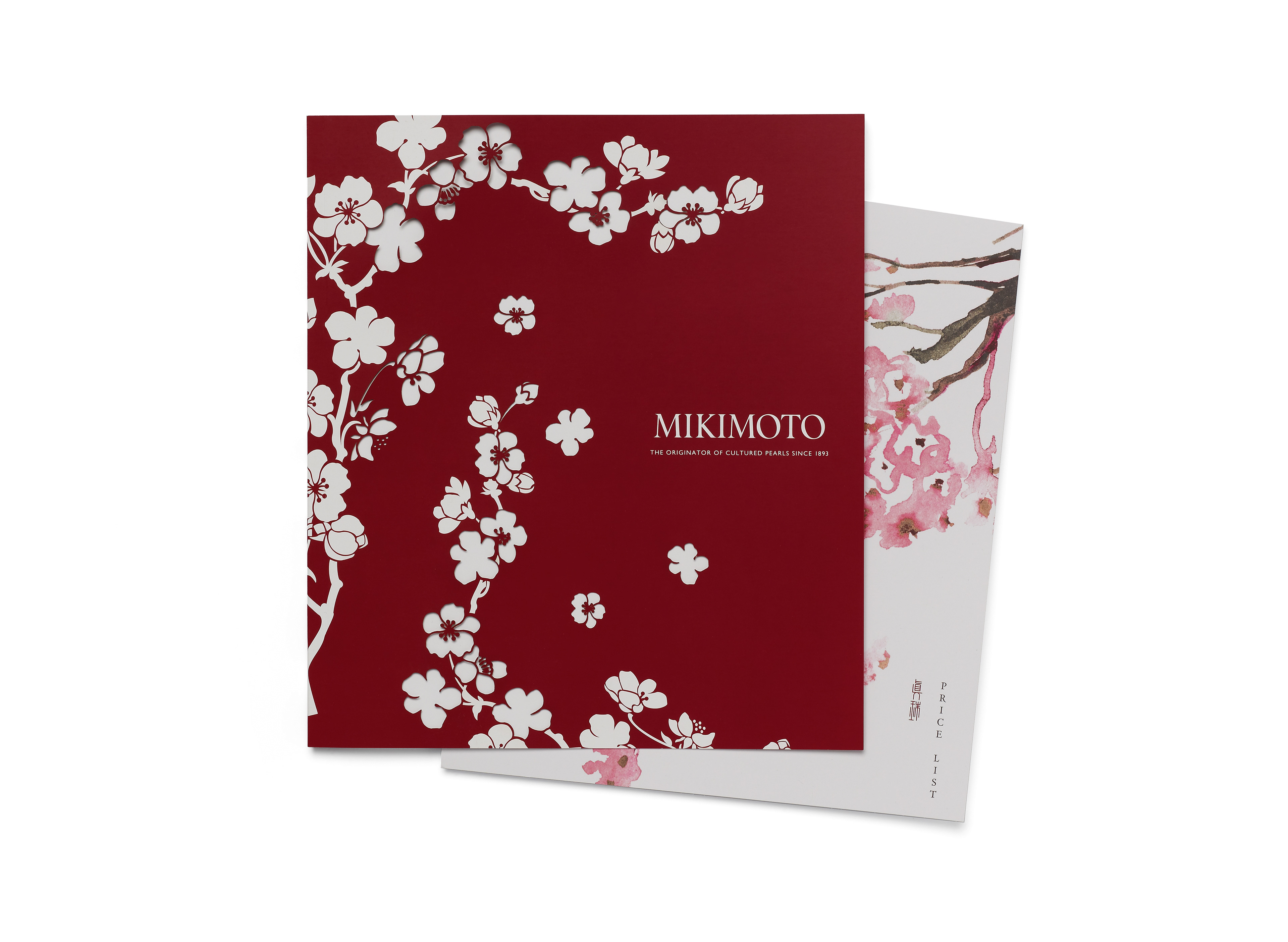
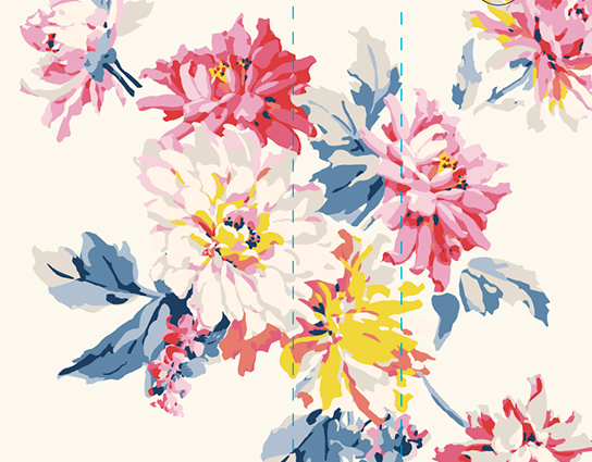
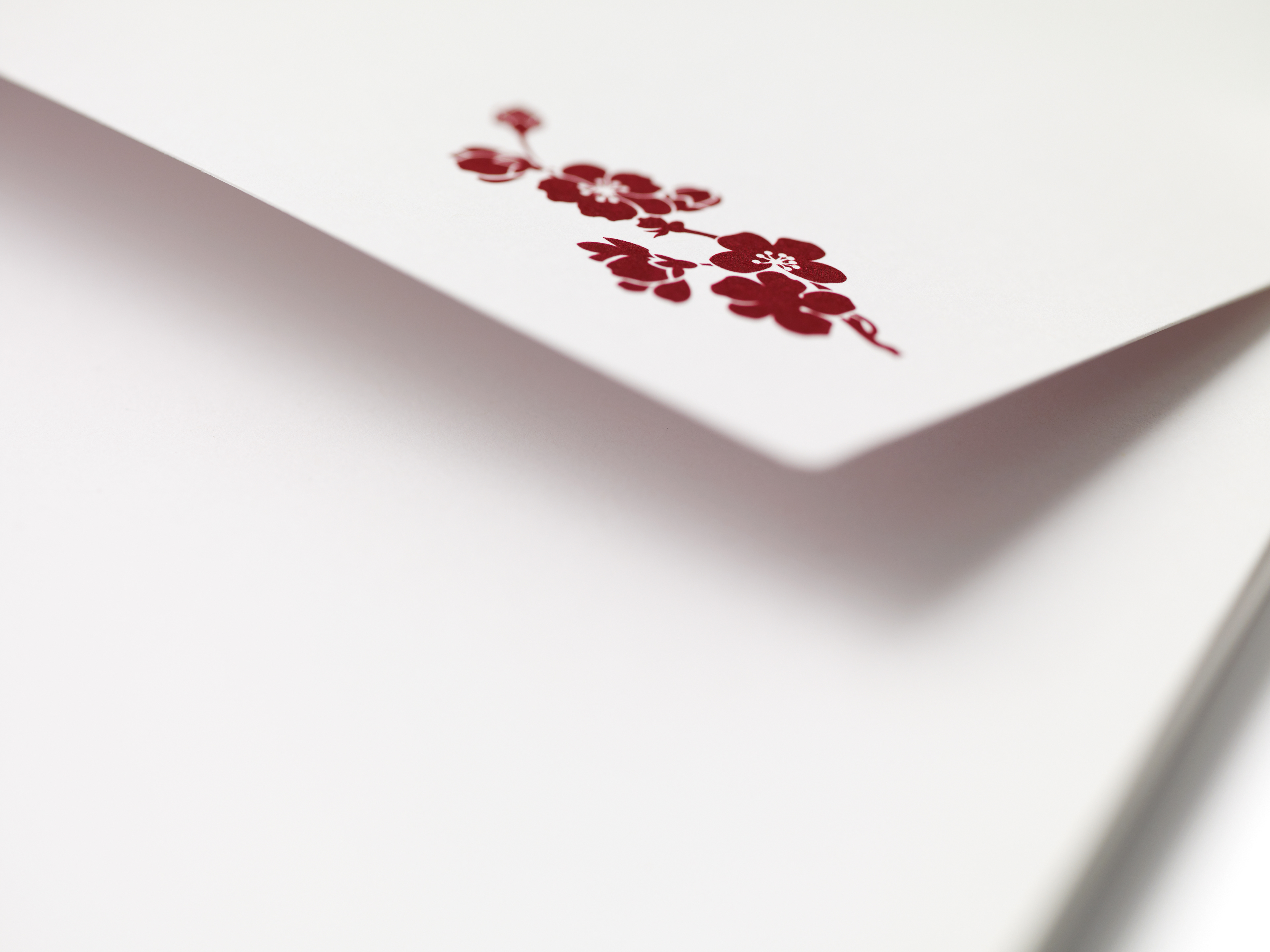
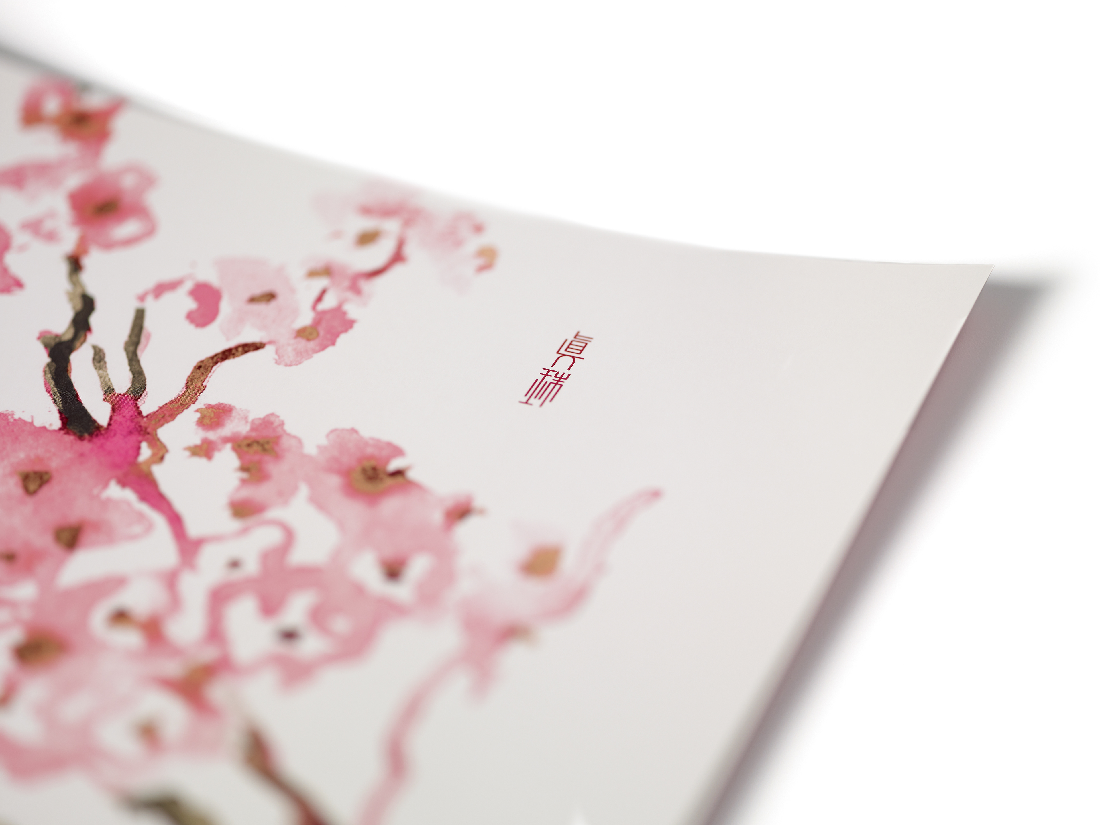
Asymmetrical envelope design to link in with the asymmetry of the jewellery. Watercolour cherry blossoms on the price list insert, on textured paper.
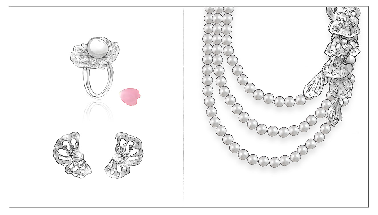
I completed scamps / visuals of the jewellery art direction style, ready for the 2 week shoot...
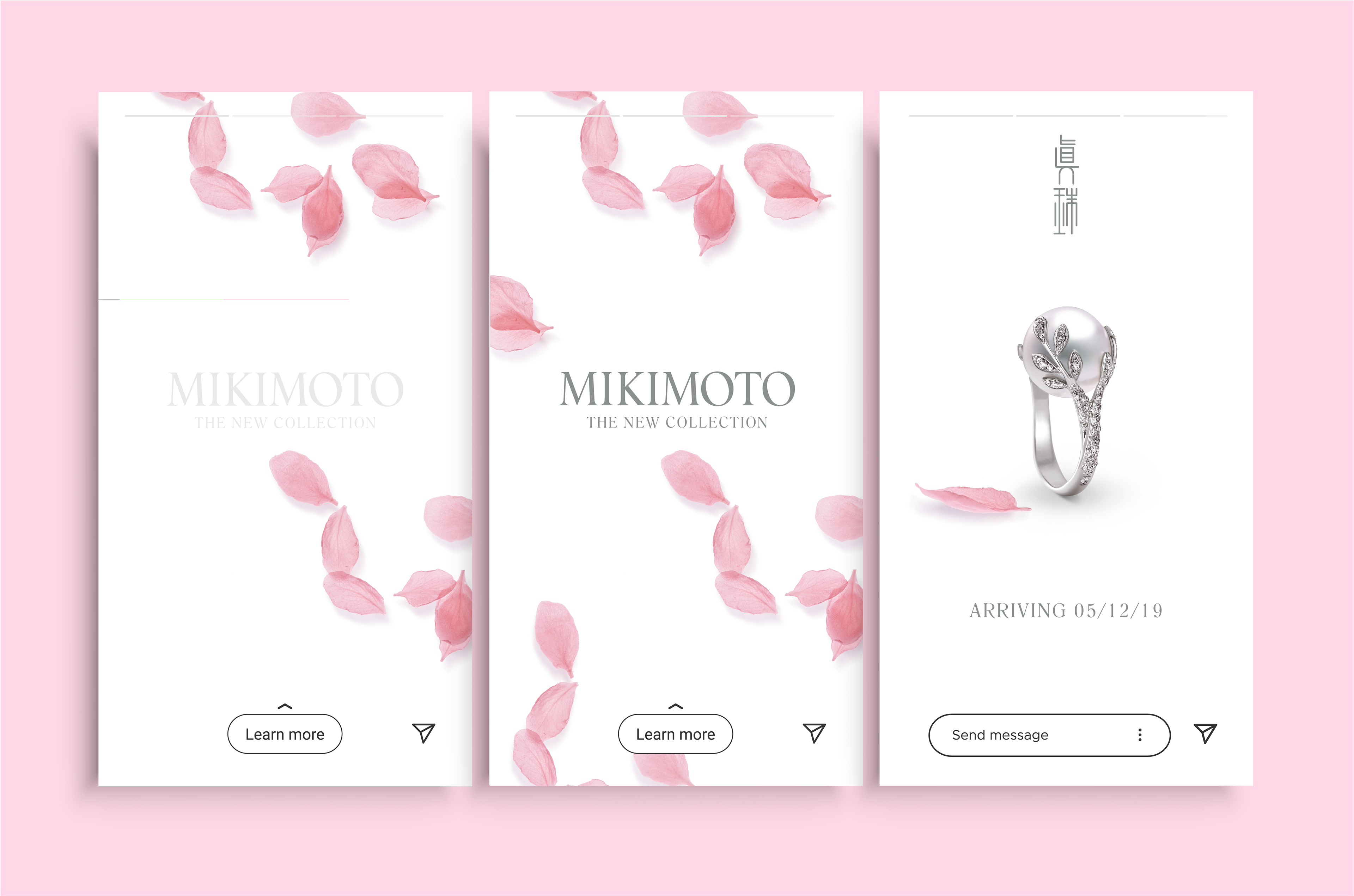
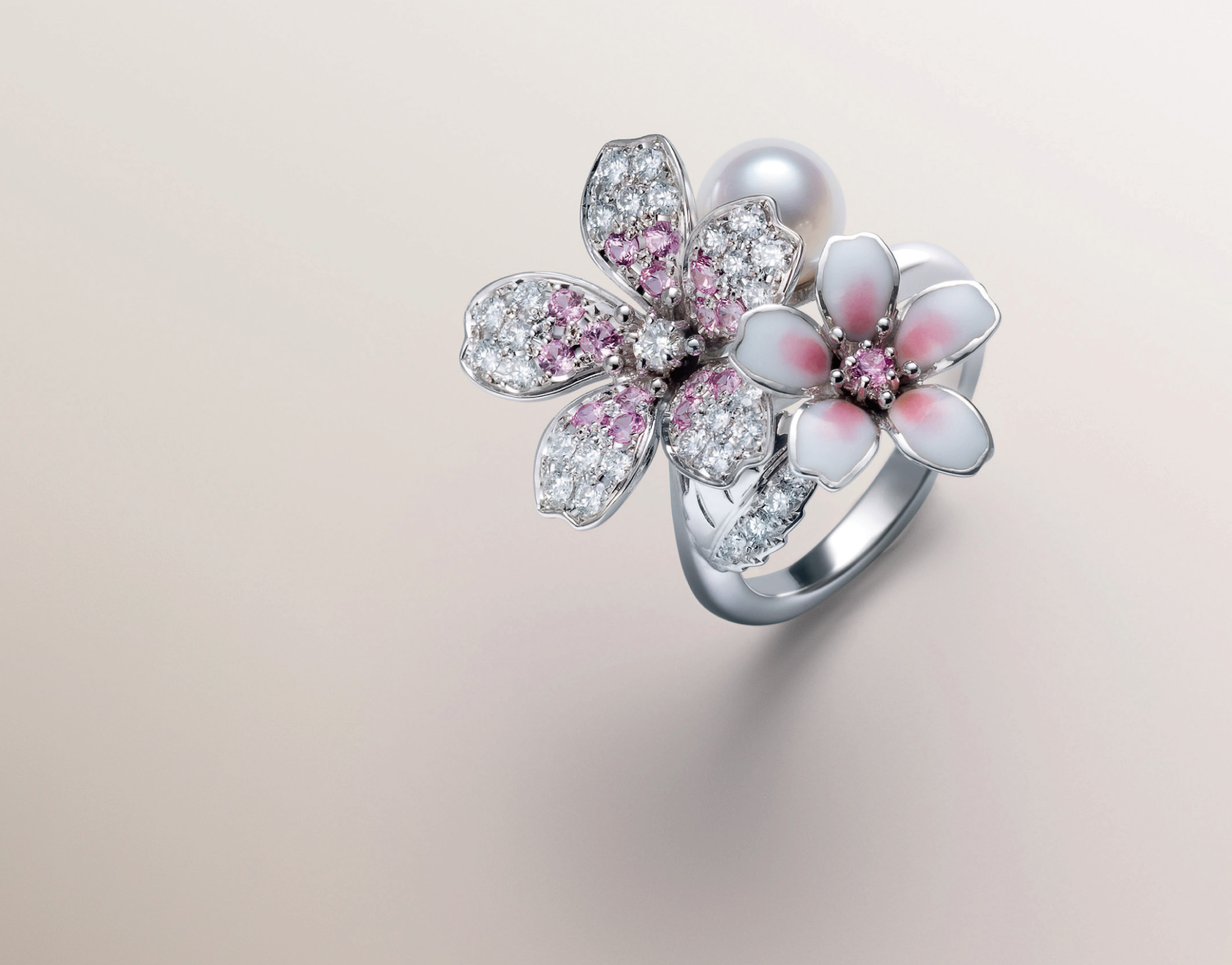
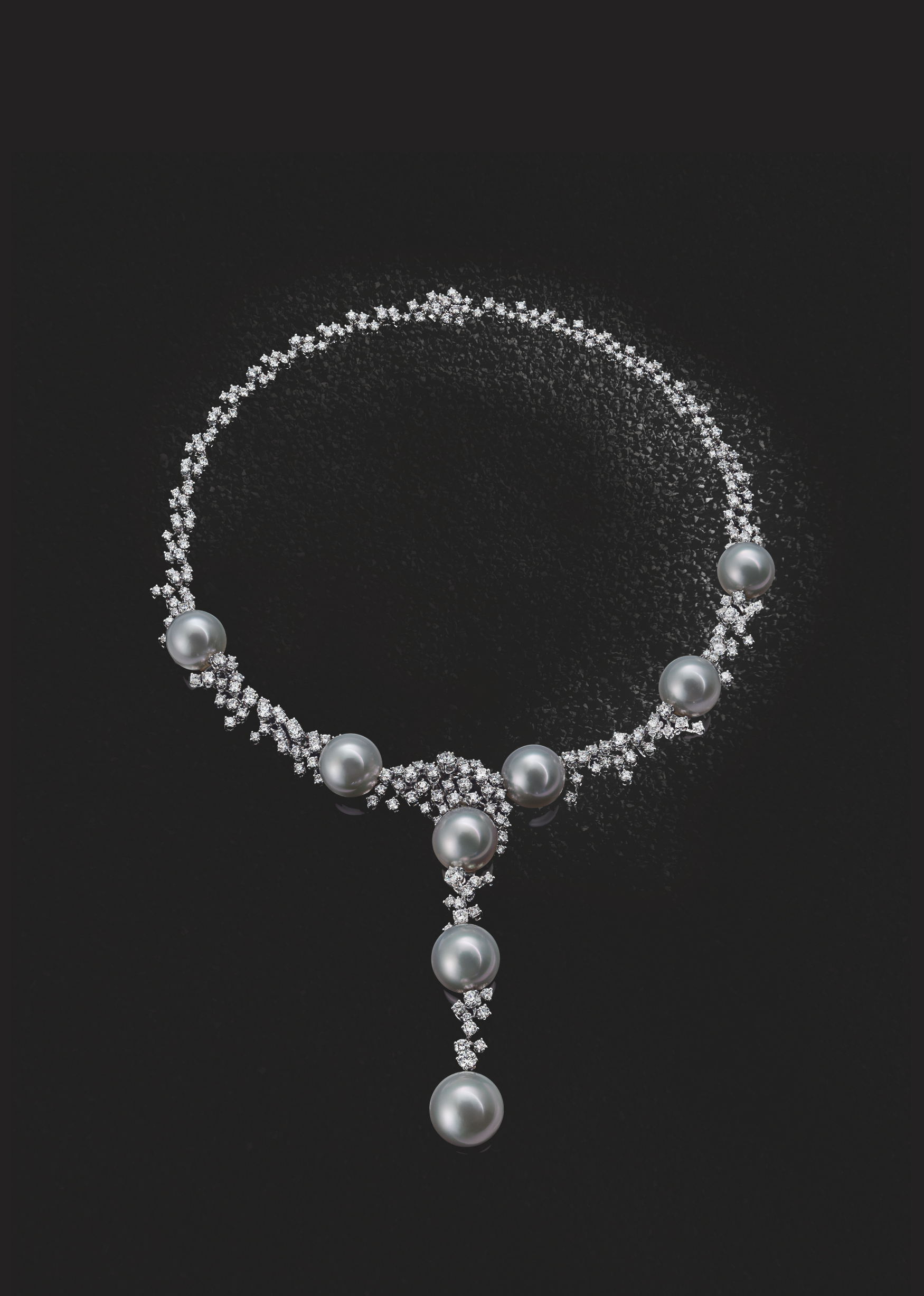
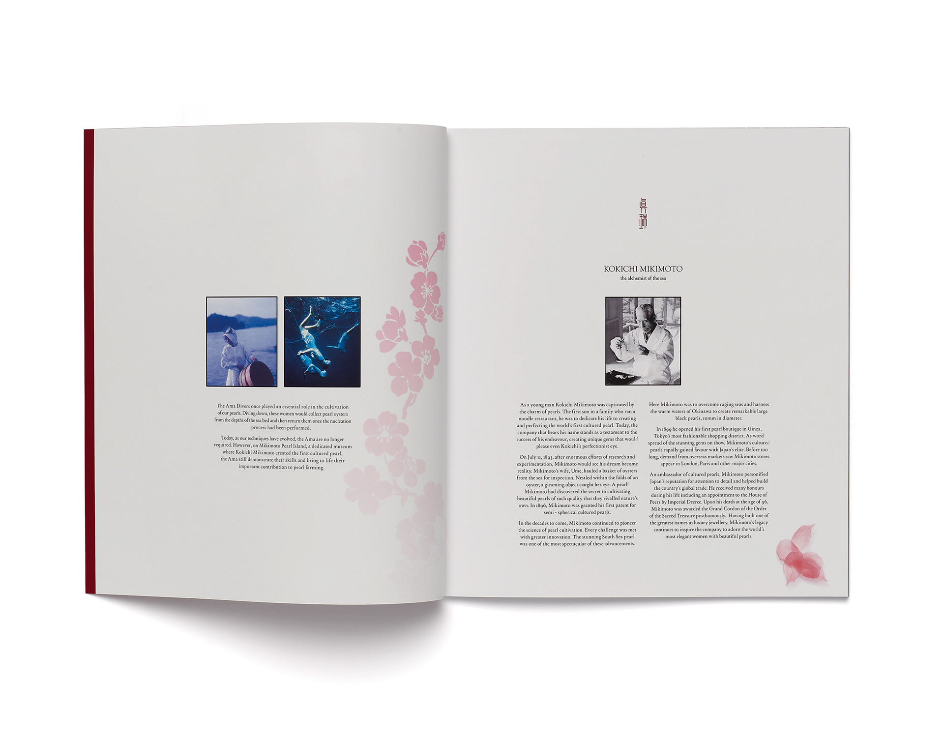
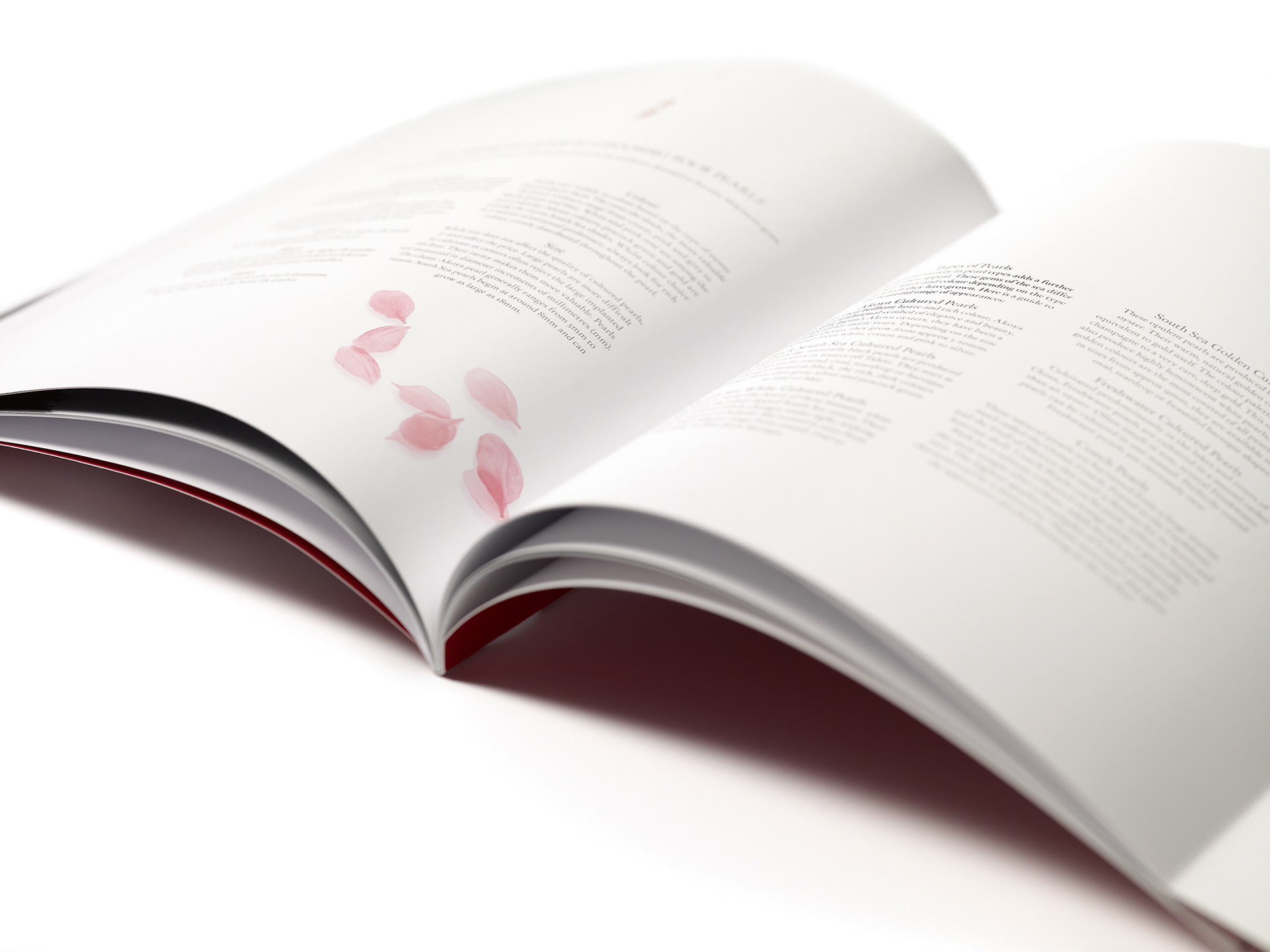
The inner spreads adopted a clean, symmetrical layout, with cherry blossom petals carefully scattered throughout.
The success of this brochure lead to the client requesting me to work on their next brochure the following year, as well as designing taxi wraps for the above campaign. Please visit the rest of my portfolio to see these projects...
I also explored other ways of marketing the brand. With social media marketing concepts and a little origami bookmark for the customer to save their favourite products, or hint to a loved one!