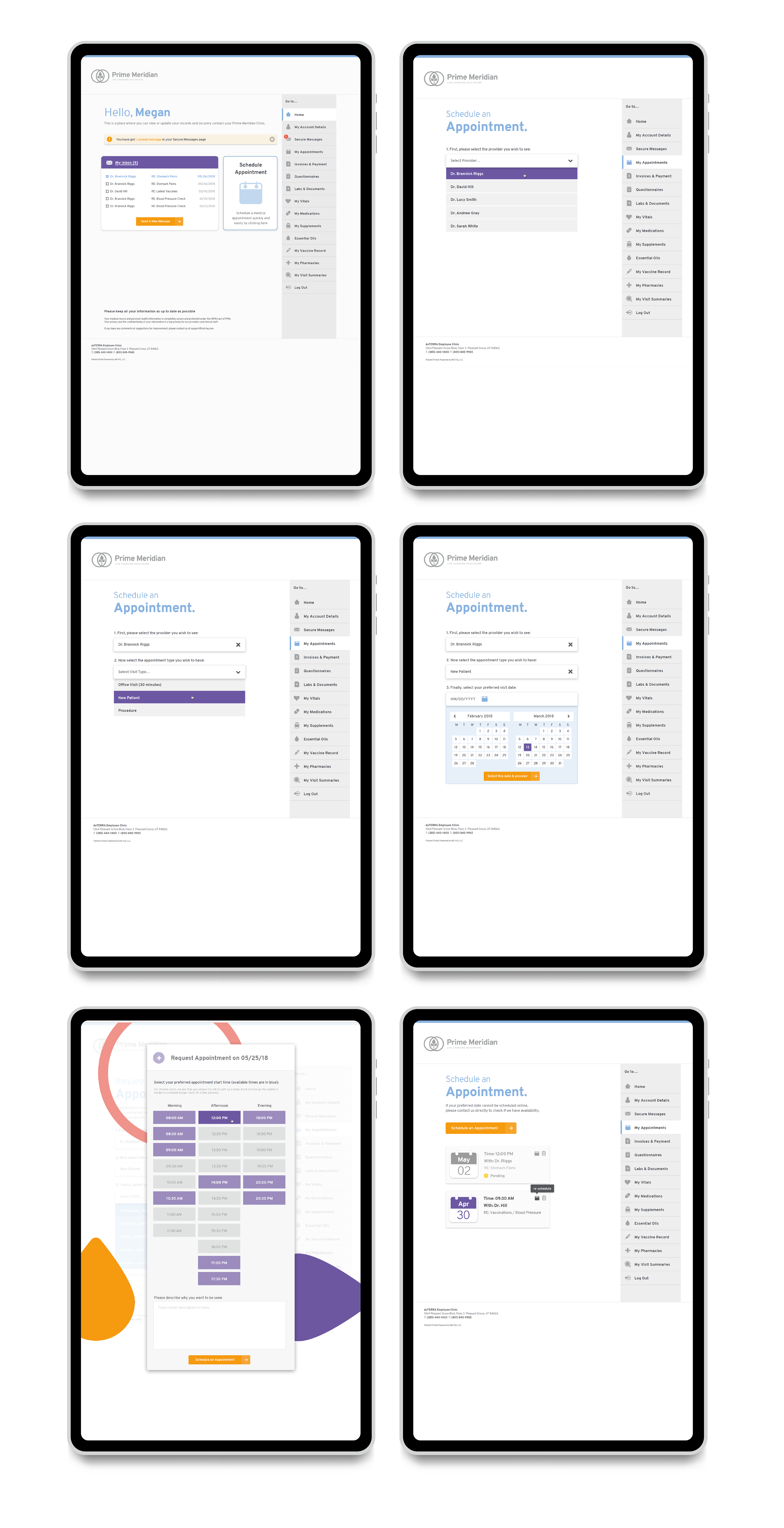


DESIGN / UI / UX After working on a US healthcare rebrand project, the success lead to their online patient portal needing a re-skin, creating a more ‘considered’ approach from a user experience point of view. We took what we had and examined how we could make it more user friendly and easier to navigate. Super clear icons were created and user tutorials helped give a seamless ‘tour’ around the portal to allow ease of use and understanding. The easy online booking system and repeat prescriptions process allowed the user to have everything they needed in one place, with handy reminders along the way that was personalised to them.